
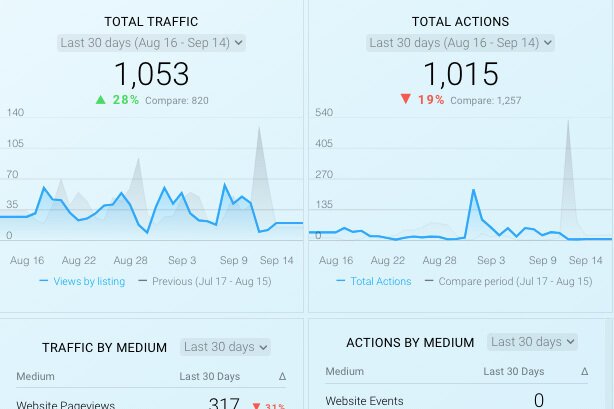
Peoria Innovation Alliance: Metrics Dashboard
Interactive dashboard for Peoria Innovation Alliance that reports website traffic and social media metrics
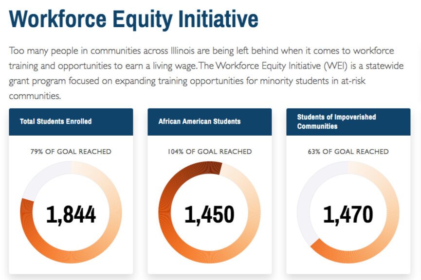
ICCB: Workforce Equity Initiative
Interactive dashboard for ICCB to create awareness of the Workforce Equity Initiative and highlight its positive impact on the community.

Sales Commission Dashboard
Interactive dashboard that displays company wide sales, profit, and commission owed

Concept to Clinic
A machine learning powered API used to detect cases of lung cancer from CT scans
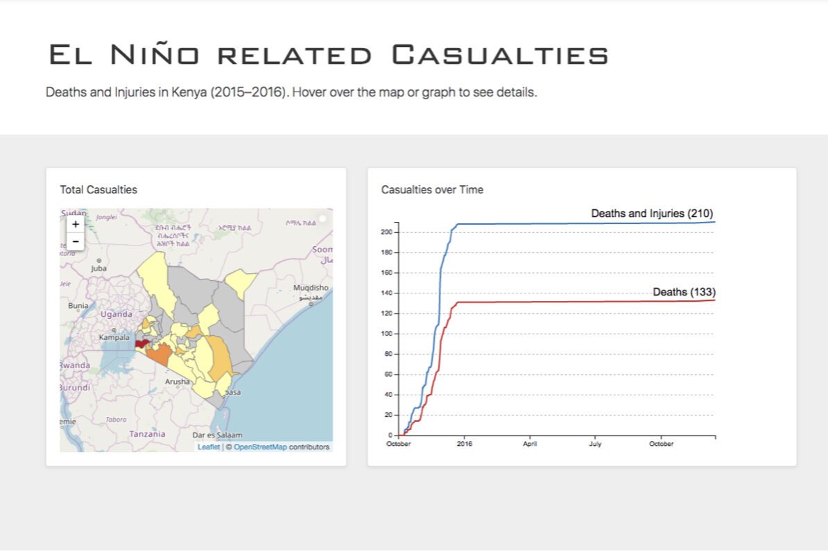
Kenya Red Cross: El Niño Dashboard
Interactive dashboard for Kenya Red Cross showing El Niño’s impact on the country
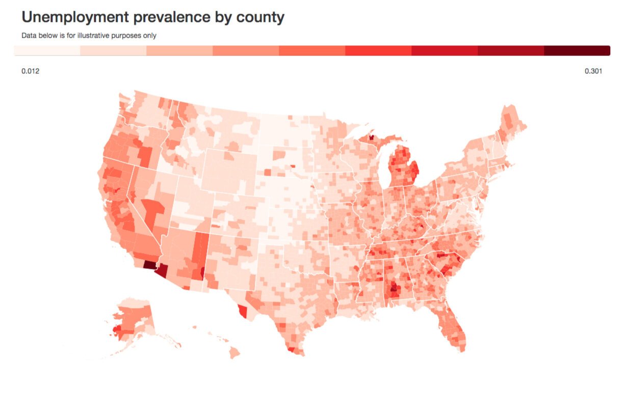
Moringa School: Choropleth Visualizer
Interactive dashboard used to teach Moringa School students how to create data driven visualizations.
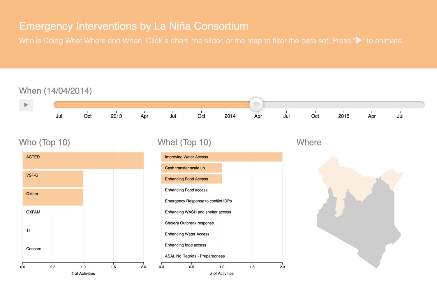
Oxfam Kenya: La Niña Consortium 4W
Showing who is doing what, where, and when in response to La Niña related events over time for Oxfam Kenya’s La Niña Consortium.